
Since the boom of mobile phones websites have adapted to make sure they’re seamless and easy to view on handheld devices.
Desktop & Mobile View
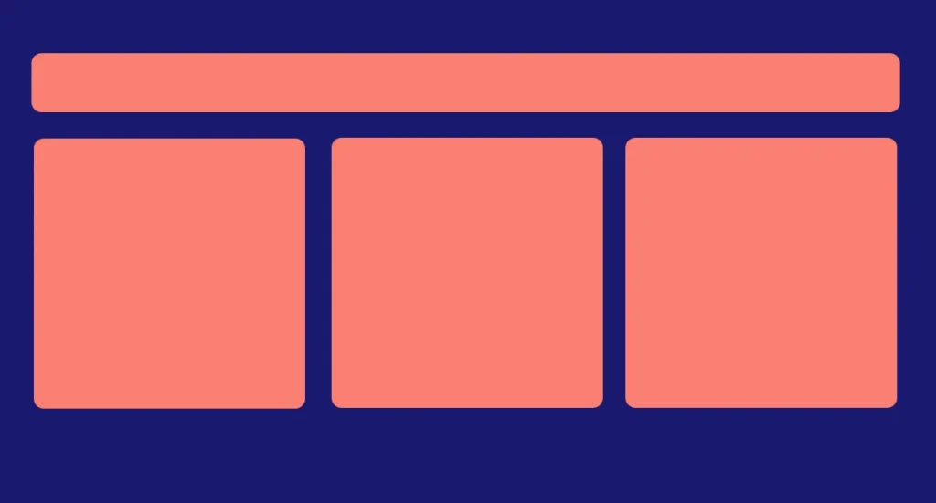
When a website is viewed on a desktop the layout is usually horizontal. Elements are placed (float) side by side using CSS floats, flex, or grids. Take a look below.
However, on mobile phones, this layout makes viewing and navigation difficult. You have to zoom and pitch to access certain parts of a page.
To offset this effect web designers stack elements on top of another so that users can just scroll down seamlessly rather than horizontal.
This is called mobile responsive.

If you change device orientation, e.g from desktop to phone the website will adjust itself accordingly to make sure all elements are aligned properly.
How to make a website responsive
CSS Media Queries
CSS Media queries allow you to specify how different elements will look on different screen sizes.
You can apply a different width to an element on a phone and desk. Take a look below:
div{
   width: 100%;
}
@media only screen and (min-width:1001px){
 div{
   width: 25%;
 }
}
Mobile phones typically have a screen size between 0 and 600px. Tablets are usually between 601 to 1000px while desktops are above 1000px. The above CSS specifies how a div’s width will change if the screen width is above 1000px.
On phones and tablets, the width will be 100% (full screen); on the desk, it will be 25%, quartering the page.
The meta viewport scale
To make sure a web page fills the entire phone screen without zooming the meta viewport scaling is used. It is set to 1 as below:
<meta name="viewport" content="width=device-width, initial-scale=1">
Benefits of mobile responsiveness
SEO boost
Search engines now favour websites that are mobile responsive since most people are accessing websites through mobile phones.
Makes reading and navigation easy
Horizontal scrolling and pinching and zooming is tedious on mobile phones. Vertical scrolling makes reading seamless.
If users cannot read your content comfortably they may bounce off impacting search rankings.
One code base
Using CSS Media queries you don’t need to create separate web pages for mobile and desk. You can just one stylesheet
Cons
Complex
Implementing mobile responsiveness on complex web layouts can be tedious. Some elements may be hidden from a mobile device to reduce clutter. This can be seen in complex web apps like the Facebook Ad manager, YouTube editor and the like.
Increase load time
Depending on how many elements need to be responsive the stylesheet can grow big which can impact load times.
The advantages outweigh the cons.
